Internal Reference · Updated June 25, 2026
Design System
A living reference for the building blocks of this site — color tokens, type styles, and every reusable component, with notes on what each one does and how it is constructed in Framer.
Foundations
Color Tokens
Theme-aware color styles. Reference these via tokens rather than hardcoded values so a single change updates everywhere. Note: a few tokens (Primary, Secondary, TextPrimary) currently exist as duplicates and could be consolidated.
Semantic
Background/Primary
rgb(255, 255, 255)
Background/Secondary (Highlight)
rgb(255, 244, 224)
Background/Tertiary (Cards)
rgb(253, 253, 253)
Text/Primary
rgb(36, 32, 0)
Text/Secondary
rgb(97, 96, 75)
Border/Primary
rgb(239, 241, 243)
Brand & Neutrals
Primary
rgb(11, 48, 7)
Secondary
rgb(47, 66, 47)
950
rgb(18, 18, 18)
500
rgb(109, 109, 109)
Light Gray
rgb(247, 247, 247)
Black / White
rgb(0, 0, 0)
Aigi Accents
Aigi Blue
rgb(91, 115, 236)
Aigi Red
rgb(255, 118, 72)
Aigi Green
rgb(59, 156, 71)
Foundations
Typography
Two families carry the whole system: Outfit for headings and Satoshi for body and UI. The presets below are the source of truth — apply them instead of styling text inline.
Outfit
Headings · H1–H4 · weight 400–500
Satoshi
Body, UI & Eyebrow · weight 500–700
Heading 1 — The quick brown fox
Outfit · h1 · the largest display size for page titles.
Heading 2 — The quick brown fox
Outfit · h2 · major section titles.
Heading 3 — The quick brown fox
Outfit · h3 · subsection and card titles.
Heading 4 — The quick brown fox
Outfit · h4 · small headings and labels.
Eyebrow — The quick brown fox
Satoshi · 700 uppercase · kickers above headings.
Large — The quick brown fox
Satoshi · 500 · lead paragraphs and intros.
Normal — The quick brown fox
Satoshi · 500 · default body copy.
Foundations
Links & Icons
Link styling is handled by link style presets (apply one to any rich-text link). Icons are pulled from four active sets — names below are exact catalog entries you can reference directly.
Link Style Presets
Available presets: Link, Link Style 1 (currently duplicated — worth merging).
Iconic
UI & interface icons (arrows, annotations, system).
Blob set
Decorative organic blob shapes for backgrounds.
Text Highliters
Hand-drawn underlines & circles to emphasize text.
Logo
Brand logo mark.
Building Blocks
Components
Every reusable piece below is a Framer component: a master with one Primary variant and a set of Replica variants. Replicas inherit everything from the primary and only override what differs, so a fix to the master flows everywhere. Text and links are wired to component variables, surfaced as the controls listed under each entry.
Navigation
The site header — logo, primary links and a CTA. The Dark variant is the desktop bar; Closed/Open drive the mobile drawer.
Variants
Dark (desktop, 1200×66), Closed (mobile collapsed, 390×68), Open (mobile drawer expanded, height auto).
Controls
variant — pick Dark for desktop, Closed/Open per mobile state.
How it’s built: a horizontal stack pins the logo left and links/CTA right via space-between. The mobile drawer is the Closed→Open variant pair: Closed has a fixed height that clips the links; Open sets height to auto to reveal them, toggled by tapping the menu icon (SET_VARIANT).
Footer
The global footer — brand block, link columns and legal row, closing every page.
Variants
Desktop (1200), Tablet (730), Mobile (390) — same content reflowing from multi-column to stacked.
Controls
variant — match to the current breakpoint (Desktop / Tablet / Mobile).
How it’s built: a top row of link columns laid out in a horizontal stack, a hairline divider, then a bottom legal row. Each breakpoint replica overrides stack direction and gaps so columns collapse vertically on smaller widths.
Badge
A small pill label used as an eyebrow above headings or to flag status.
New Feature
Variants
DarkBadge (dark fill, light text) and LightBadge (light fill, dark text).
Controls
variant — DarkBadge / LightBadge; title — the pill text.
How it’s built: an auto-width horizontal stack with rounded corners and tight padding wrapping a single text node bound to the title variable. The two variants only swap fill and text color.
Button With Link
The primary call-to-action button used across the site. Fully themeable per instance and wraps a real link.
Variants
Filled (solid background) and Outlined (border only, transparent fill).
Controls
variant, title, link, plus fillColor / borderColor / textColor for per-instance theming.
How it’s built: an auto-width horizontal stack (htmlTag button) with a label text node bound to the title variable. Padding gives the tap target; the whole frame carries the link. The Outlined replica overrides fill to transparent and adds a border, keeping geometry identical to Filled.
Form Button
The submit button for forms. Its variants double as form states so it reflects submission progress automatically.
Variants
Default, Loading, Success, Error, Disabled — plus hover & pressed gesture states on Default.
Controls
variant — usually wired to the form’s submit state rather than set by hand.
How it’s built: a fixed 240×40 button whose replicas (Loading/Success/Error/Disabled) swap label, color and icon. A form maps each submission phase to the matching variant, so the button animates between states on submit. Hover and pressed are gesture variants stacked beneath Default.
Pricing Card
A single plan in the pricing section — name, price, feature list and a CTA. The Highlight variant marks the recommended plan.
Variants
Normal (standard surface) and Highlight (emphasized recommended plan), each with hover gestures.
Controls
plan, price, feature1–feature4, buttonLabel, link, variant.
How it’s built: a vertical stack with auto height — plan name, price row, a column of feature lines, and a Button instance at the bottom. Each feature is its own text node bound to a variable. Highlight overrides fill/border to stand out while keeping the same structure.
Testimonial Card
A customer quote with attribution and avatar, used in the testimonials grid.

This app completely changed how our family stays organised. Honestly couldn't go back.
Maria Lindqvist
Setup took two minutes and the kids actually use it every day. That says everything.
Johan Berg
Variants
Normal and Highlight (accented surface for the lead testimonial).
Controls
testimonial (quote), name, image (avatar), variant.
How it’s built: a fixed 378×380 vertical stack — the quote text node up top, an attribution row (avatar image + name) at the bottom. Highlight swaps the fill for an accent surface while preserving layout.
Feature Card
A large feature tile pairing a visual with a short headline, body and optional button. The backbone of the features section.
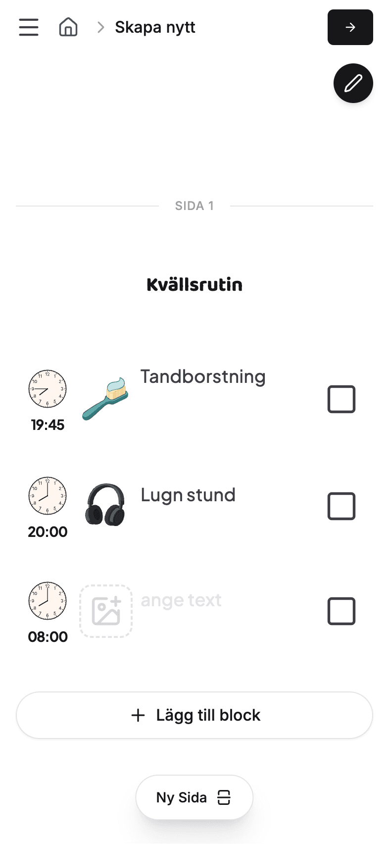
Skapa ditt första bildstöd redan idag
Plan your week visually and let everyone see what is coming up next.
Variants
CanvasCard, SymbolsCard, AppCard, CTA — plus dedicated Tablet & mobile replicas and hover gestures (17 variants total).
Controls
heading, text, buttonText, buttonColor, linkButton, fill.
How it’s built: a large stack (≈533×480) with a media area and a text block (heading + body) plus an optional button. The many variants are responsive sizes (Tablet 729, mobile 322) and content modes (canvas vs. symbols vs. app screenshot) sharing one master.
Section Header
The standard intro block placed at the top of most sections — an eyebrow, a heading and a supporting line, all left- or center-aligned.
Built for busy families
Everything you need to keep the week organised, in one calm place.
Variants
Variant 1–5 — differences in alignment, width and whether the supporting text shows.
Controls
title, text, variant.
How it’s built: a vertical stack of an eyebrow/badge, a heading text node and a body text node, each bound to a variable. Variants change alignment (left vs centered) and max width so the same header suits both wide and narrow sections.
FAQ Item
A single expandable question. Tapping the row toggles between the Open and Closed variants.
How many family members can I add?
As many as you like — every plan supports unlimited members within a workspace.
Variants
Open and Closed (desktop, 617 wide) plus FAQMobileOpen / FAQMobileClosed and a hover gesture.
Controls
question, answer, variant.
How it’s built: the question row sits in a horizontal stack with a +/− icon; the answer lives below. Closed has a fixed height that hides the answer (and shows a + icon); Open sets height to auto and shows the answer (− icon). Tapping switches variants via SET_VARIANT. The FAQ List component simply stacks several of these.
CTA
The closing conversion block — a headline, a short line of supporting copy, and the app-store download buttons.
Get started for free
Start your free 3-month subscription from the links below.
Variants
Desktop, Tablet, and Mobile — each reflows the buttons and tightens the type scale.
Controls
title, text, variant.
How it’s built: a centered vertical stack holds the title and supporting line above a button row. The breakpoint variants only adjust alignment, spacing, and type scale — the headline and copy stay bound to the title and text controls.
Blog Card
A linked article preview — cover image, publish date, and title — used in the blog index grid.

Variants
Desktop and Mobile — Mobile narrows the column and scales the title down.
Controls
image, date, title, link.
How it’s built: the whole card is a single link wrapping a rounded cover image with the date and title stacked beneath. Bound to a CMS Articles item in a collection list, each card becomes one post and the link points to the article’s detail page.
Process Card
A numbered step in a how-it-works sequence — step number, title, and a short explanation on a colored surface.
01
Connect Accounts
Securely link your bank and business tools in minutes.
Variants
Layout 1 and Variant 2 — two arrangements of the same step, number, and copy.
Controls
step, title, content, icon, background.
How it’s built: a padded, rounded surface whose fill comes from the background control. An icon and the title sit together with the supporting copy below, while the step number is tucked into a corner badge. Sequencing several cards with rising step numbers forms the process section.
Icon Bubble
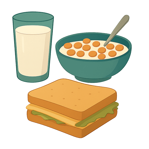
A rounded container that frames a single symbol or app glyph — used to give icons a consistent, branded badge.
Variants
Default and Big — same bubble at two sizes (shown left to right).
Controls
symbol.
How it’s built: a square, heavily rounded frame centers the symbol image. The Big variant simply scales the frame and symbol up, keeping the same proportions so badges stay visually consistent wherever they appear.
Blog Post
The featured-article unit used in the blog layout. A larger lead post sits above smaller secondary posts to create hierarchy on the index.
Variants
Lead Post (Desktop / Mobile) for the large featured story, and Secondary Post for the smaller stacked items.
Controls
image, title, link, variant.
How it’s built: a linked card pairing a cover image with the title. The Lead variant gives the image more room for emphasis, while the Secondary variant compacts it for the supporting column. Bound to CMS Articles items, the variants let one component cover both the headline story and the list beneath it.
The Moving Parts
Motion & Visuals
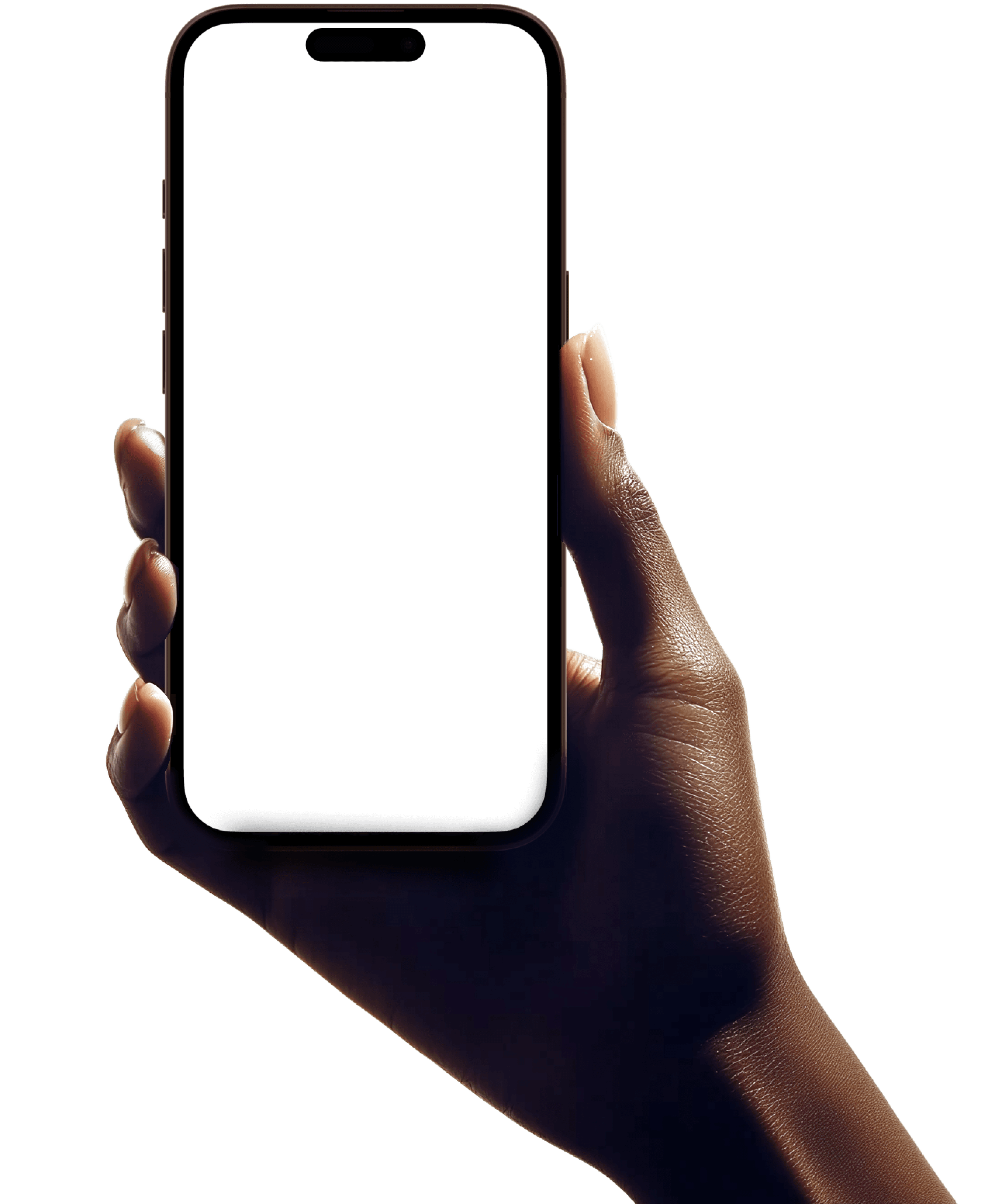
Beyond the static building blocks, the site leans on a layer of device mockups, scrolling marquees, and layered gradients to give the marketing pages depth and movement. These are the pieces that make the header feel alive — a phone cradled in a hand, app screens drifting past, and soft color washes flowing behind everything.
Phone in Hand
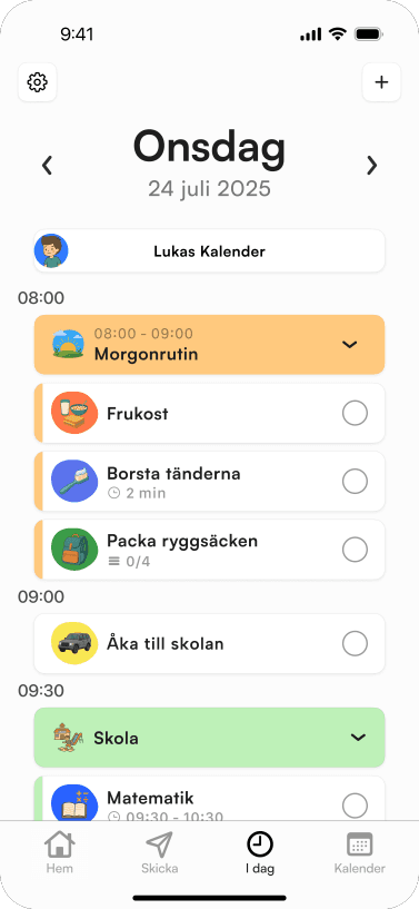
The hero centerpiece — a hand holding a phone whose screen is swappable. This is what anchors the top of the homepage above the moving background.
Variants
Desktop, Tablet, and Phone — each scales the hand and device to suit the breakpoint.